B.P. HIVALE EDUCATION SOCIETY
Branding, Visual Identity, Merchandise, Presentation Design
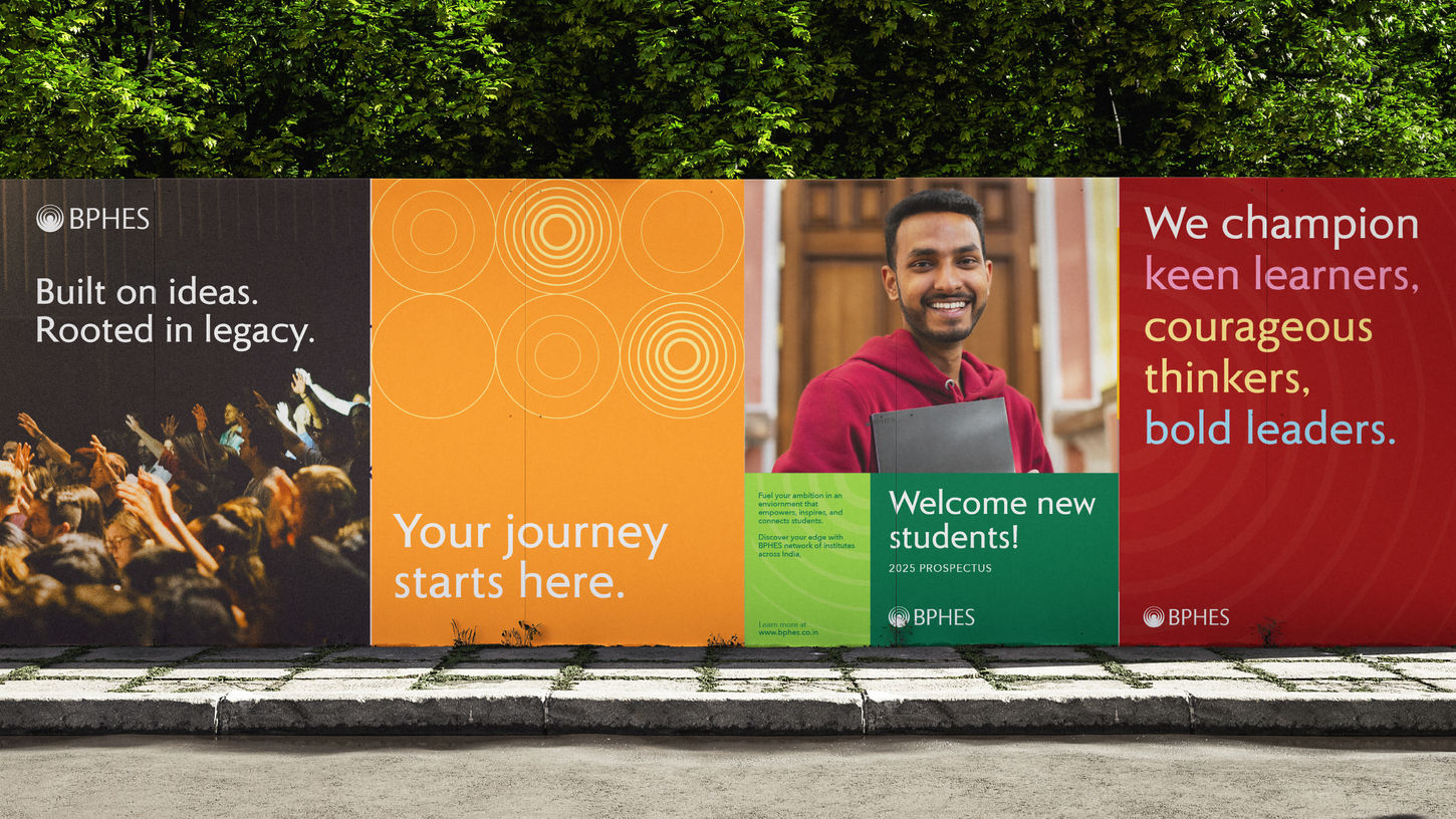
Established in 1947 with Ahmednagar College, the B.P. Hivale Education Society has since grown to encompass six institutions across Maharashtra, quietly shaping the intellectual foundations of generations of Indians. With its large student body and ambitious new areas of work, the society engaged Praxis to unify its institutes under a cohesive brand strategy and visual identity that would resonate with future cohorts, faculty, and associated stakeholders. Reintroduced simply as BPHES, we repositioned the brand as a dynamic ecosystem that champions academic excellence and lifelong learning, while remaining deeply rooted in the founding values of an emerging nation: the pursuit of knowledge and truth.
Our logo is inspired by the Bindu, traditionally placed at the center of the forehead, which symbolises origin, focus, and higher purpose. A fitting metaphor for the rippling impact that begins with deep knowledge and radiates outward — across communities, generations, and disciplines. The tagline, ‘Believe. Become.’ serves as a simple and direct way of asserting this influence. That students need only believe in themselves, while the institutions nurture their journey of becoming.
The visual language emphasizes BPHES’s community focus and commitment to growth and lasting impact. The ripple, drawn from the Bindu, forms a distinctive brand device that brings cohesion and character across applications including merchandise, posters, and watermarks. The colour palette takes inspiration from India’s jewel-toned heritage and includes deep, medium, and light tones that offer both consistency and creative flexibility. Combined with Roma, a sans serif typeface chosen for its clarity and subtly flared forms, the system presents BPHES as a forward-looking Indian institution grounded in purpose.


