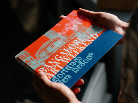
BANGALORE ART WEEKEND
Branding, Visual Identity, Social Media
A new cultural IP initiated by Usual Suspects, Svasa Life, Regalium, and The Curator Mag, Bangalore Art Weekend celebrated the tech city’s distinct perspectives on creativity through a vibrant program of talks, workshops, film screenings, and panel discussions. With its roaring success, the festival now extends its footprint to Delhi, with future editions in Mumbai and Kolkata.
Praxis worked closely with the founding teams to design the festival’s evolving visual identity across cities. Rooted in the festival’s theme ‘*Liminal Spaces’*, the design explored the idea of thresholds — transitions between art forms, disciplines, tradition, and technology. The palette of vivid red and blue first appeared in early concept notes, a detail that found its way into the final system as a nod to the festival’s origins. For 2025, the identity remains consistent across cities, creating a strong sense of recall while reinforcing the festival’s growing national presence.
Typography, which was central to the festival visual system, drew from India’s architectural and craft traditions. The bold, angular serifs of the primary display type found its counterpoint in an italic serif, allowing the two to converse — heritage meeting modernity. Wavy lines inspired by a fingerprint add a textural layer, symbolising the imprint of the organisers left on the city. It reflected their intent to shape each edition with care and authorship, marking their growing presence across geographies.
Across applications, the layout was built around a clear horizon line, a visual threshold where red met blue, and image met text. From this meeting point, information seemed to emerge and dissolve, mirroring the festival’s central idea of crossing boundaries between worlds, disciplines, and ways of seeing.


