BHAGAT TARACHAND
Branding, Visual Identity, Packaging
For over a century, B. Bhagat Tarachand has been more than a restaurant. It is a place where flavours become memories and recipes become heirlooms. Rooted in homestyle cooking and uncompromising on freshness, the brand’s positioning, “a tradition of excellence, served fresh,” became the foundation for the rebrand. This line reflects BBT’s enduring commitment to quality while celebrating its role as a trusted name in India’s culinary landscape.
At the heart of the new identity lies the Navratna—nine secret gravies that remain a closely guarded family treasure. This idea shaped the emblem: nine interlocking diamonds forming a radiant symbol with a bold “B” at its center. Paired with a logotype that draws from Indian letterforms yet feels modern and approachable, the identity captures both legacy and accessibility. The design system extends through the diamond motif into a versatile brand pattern, while a palette of maroon and yellow grounds the visual language in Indian sensibilities. These colours evoke roasted spices, depth of flavour, and the warmth of shared meals.
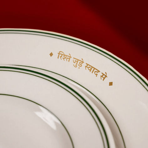
The tagline, 'Rishtey Jude Swaad Se', builds on this foundation. It celebrates not only the food but also the relationships nurtured around every table. Accessible and heartfelt, it captures BBT’s timeless promise of togetherness through taste. The rebrand is not a departure but a renewal, designed to carry forward a century-old legacy of hospitality with freshness and integrity for generations to come.


